MARK BERLADYN
CRYPTO EXCHANGE
FINTECH
PRODUCT DESIGNER
2021 — 2023
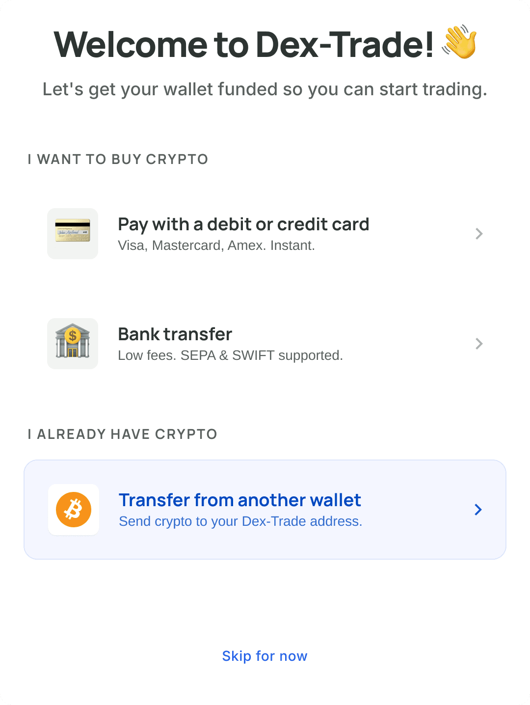
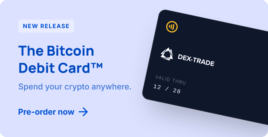
Dex-Trade
Three problems found, three solutions shipped — KYC drop-off, first-time deposits, and listing automation.
20%
6%
KYC drop-off rate
11.3%
27.8%
First-time deposits
Weeks
1 day
Listing process

CONTEXT
No system.
No ownership.
Start from zero.
I joined Dex-Trade with no design system, no component library, and no clear product ownership over UX. The first thing I did was audit the interface — buttons had three different styles, inputs were inconsistent across pages, every element was coded from scratch instead of reused.
Before touching any user-facing problem, I built the design system from zero: components, variants, auto-layout, design tokens via Tokens Studio, documented in Storybook, integrated directly with frontend developers.
That foundation made everything that came next possible.


PROBLEM 01
KYC drop-off
A task came in: figure out why users weren't completing KYC verification. Passing KYC unlocked higher limits and key features — so low completion was directly hurting the business.
I started with the numbers: 20% of users who started KYC weren't finishing it. Then I looked at heatmaps, device breakdown, competitor flows. Then I did it myself.
"I felt uncomfortable. The process had no visible end — no progress indicator, no sense of how many steps remained."
I talked to colleagues who had gone through KYC. Nobody had complaints about errors — but nobody was enthusiastic either. "Boring." "Did it, whatever." The pattern wasn't frustration — it was disengagement.


01
Progress bar across all steps
Users could see exactly where they were and how much remained — no more guessing.
02
Friendly copy, not bureaucratic
Replaced "ATTACH PASSPORT PAGES 1-2" with human language that explains, not threatens.
03
Explanation screen before verification
A screen before the process explaining why KYC protects their account — not just threatening limits.
RESULT — KYC COMPLETION
20%
6%
End-to-end listing time. Fully automated from application to verification to approval.
PROBLEM 02
First-time deposits
The exchange was running airdrop campaigns — giving away tokens to attract new users. It worked for acquisition: 600K+ registered users.But only ~60K had ever funded their wallet. A 10× gap.
I registered a fresh account and followed the flow. After registration — you land on the homepage. Same page you came from. No guidance, no next step. The exchange had hundreds of features — crypto games, trading tournaments, rare coins, a debit card — but none of it was visible or accessible to a new user with zero balance.
I couldn't run user interviews — budget constraints. So I worked with marketing, the founder, and the sales team. Mapped what mattered to each type of user. Then designed two solutions.
SOLUTION 1
New users
One screen added immediately after registration — three deposit options (card, bank transfer, crypto), skippable, with a clear explanation of value. Not a hard gate — an invitation.
NEW USER REGISTRATION → MADE A DEPOSIT
11.3%
27.8%
First-time deposit rate. One screen added after registration — three deposit options, skippable, with a clear explanation of value.
SOLUTION 2
New users
A dashboard showing wallet balance, top exchange features, latest listings, referral link, open trading positions. All entry points in one place instead of scattered navigation.
After launch, users landed on the dashboard instead of the homepage. But overall engagement with exchange features didn't grow meaningfully — the metric fluctuated within 3%.
INACTIVE USER DASHBOARD
~3% reactivation
But the marketing banner had a 70% click rate among visitors who saw it. The dashboard didn't change habits — but the interruption worked.
The insight wasn't about navigation — it was about behavior. Users find the feature they need and return to it directly. Changing the path doesn't change the habit."
— Insight from the dashboard experiment
PROBLEM 03
Listing automation
The exchange listed new cryptocurrencies through direct back-and-forth between sales managers and token project teams. Weeks of emails, negotiations, document exchange. Manual, slow, unscalable.
I worked with the sales team and marketing to map the full listing process — every step, every bottleneck, every document. Then designed an automated flow: token projects apply directly through a structured form, submit required documents, go through verification, get listed.
Sales team reviews and approves — without managing individual conversations.
NEW USER REGISTRATION SCREEN
Weeks
1 day
End-to-end listing time. Fully automated from application to verification to approval.

WHAT I LEARNED
01
Simple interventions beat complex ones. A progress bar and friendlier copy cut KYC drop-off by 70%. One screen after registration doubled deposit conversion.
02
Honest results matter more than good-looking ones. The dashboard had low reactivation — but revealed a real insight about habit and interruption that changed how I think about onboarding.
03
A design system isn't a deliverable — it's infrastructure. Without it, nothing that came after would have been possible at the pace we moved.